Open source · 2022
Quire
An accessible design system I maintain, where every colour pair ships with its contrast ratio.
- Client
- Open-source design system (fictional project)
- Role
- Creator and maintainer
- Team
- Around thirty contributors
- Duration
- Since 2022
At a glance
- 48components
- 0serious axe violations in the docs
- 120+teams using it (sample figure)
Results are sample figures for this fictional project.
Why another design system
Most design systems treat accessibility as a checklist at the end. I wanted one where it is part of the API: you cannot pick a text colour without seeing whether it passes on the background you chose.
Tokens as a contract
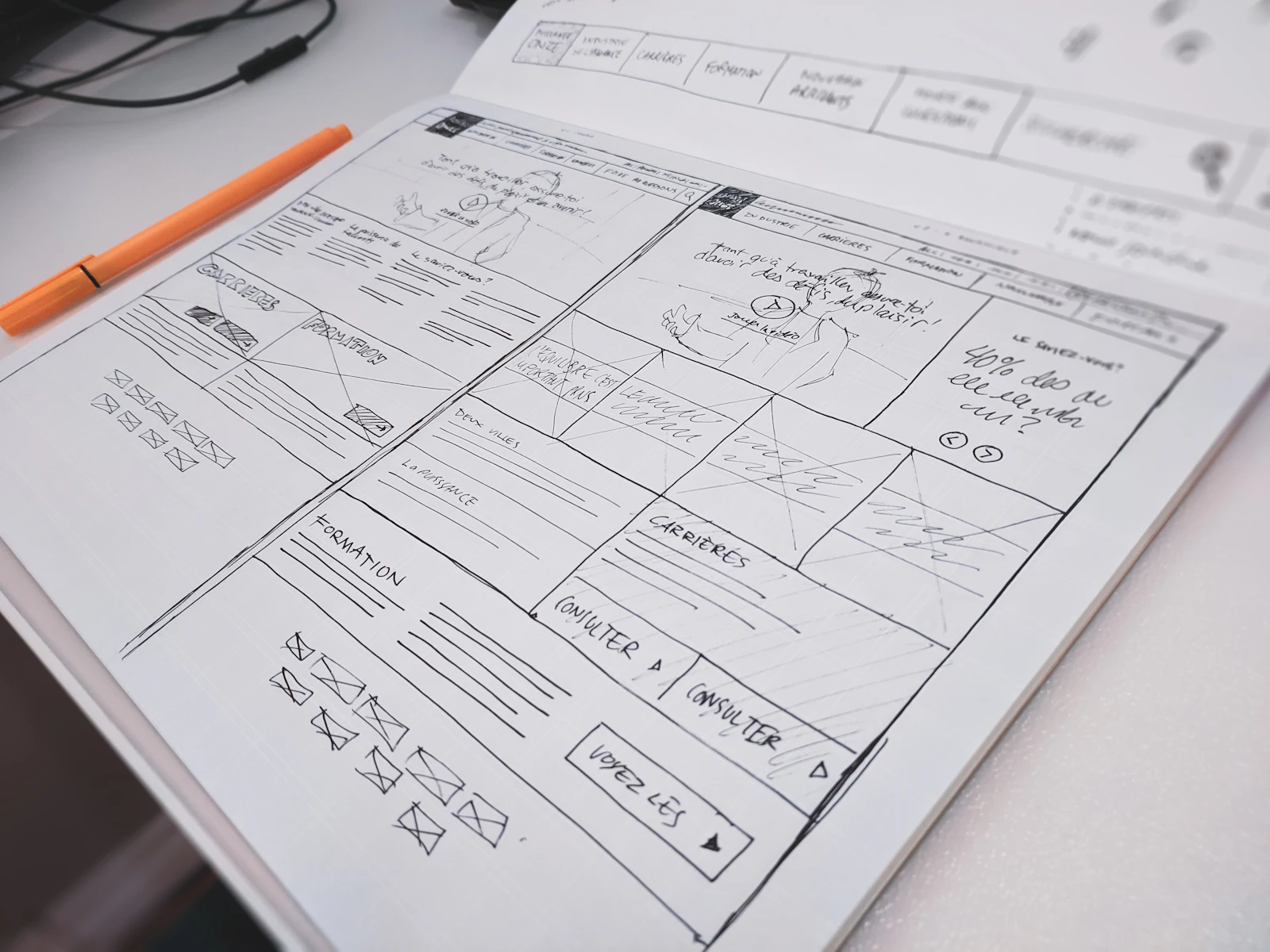
Colours are defined as roles, not swatches. Each role pair is tested in CI and the ratio is printed in the docs next to the token. Focus styles are designed components, not browser defaults.
The docs render the real components, so what you read is what ships.
- focus is designed, not left to the browser
- every pair ships with its ratio
- docs render the real component
Quire is the only system where I never have to ask whether something is accessible. The answer is on the page.
Where it is now
Quire has 48 components, a monthly release and a small, kind contributor community. The docs site has no serious automated accessibility violations, and we treat a new one as a release blocker.
What I’d do differently
I wrote too many components too early. A design system earns trust by being boring and stable; the first year should have been twelve components, done properly.
Sample case study: the client, team, figures and quote are fictional.