Health · 2025
Night Ward
A ward board for night-shift nurses that turns forty competing priorities into one calm list.
- Client
- Corrie Bay Hospitals (sample client)
- Role
- Lead product designer, front-end prototypes
- Team
- Two nurses on secondment, one developer and me
- Duration
- 7 months
At a glance
- 22 → 14 minaverage handover time
- −38%non-urgent alerts at night
- 9 in 10night nurses who chose it over the old board
Results are sample figures for this fictional project.
The problem
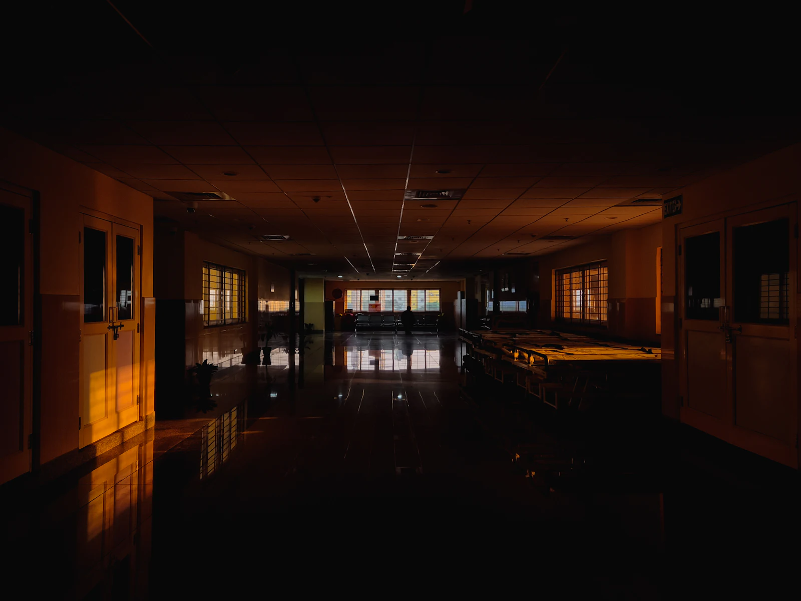
At three in the morning a medical ward is quiet, but it is not calm. The electronic board showed every bed with equal weight: forty coloured tiles, each of them able to beep.
Nurses had quietly stopped trusting it. Most kept a folded paper list in a pocket, because the paper told them what to do next and the screen did not.
Shadowing the night
I spent six night shifts on two wards, with permission and a badge that said “observer, not staff”. I wrote down every glance at the board and every interruption, with the time.
The moment that shaped the project came at 04:10 on the second night. A nurse silenced a reminder for a patient who had finally fallen asleep. The system had no way to say “this can wait”, so it kept asking.
One list, in time order
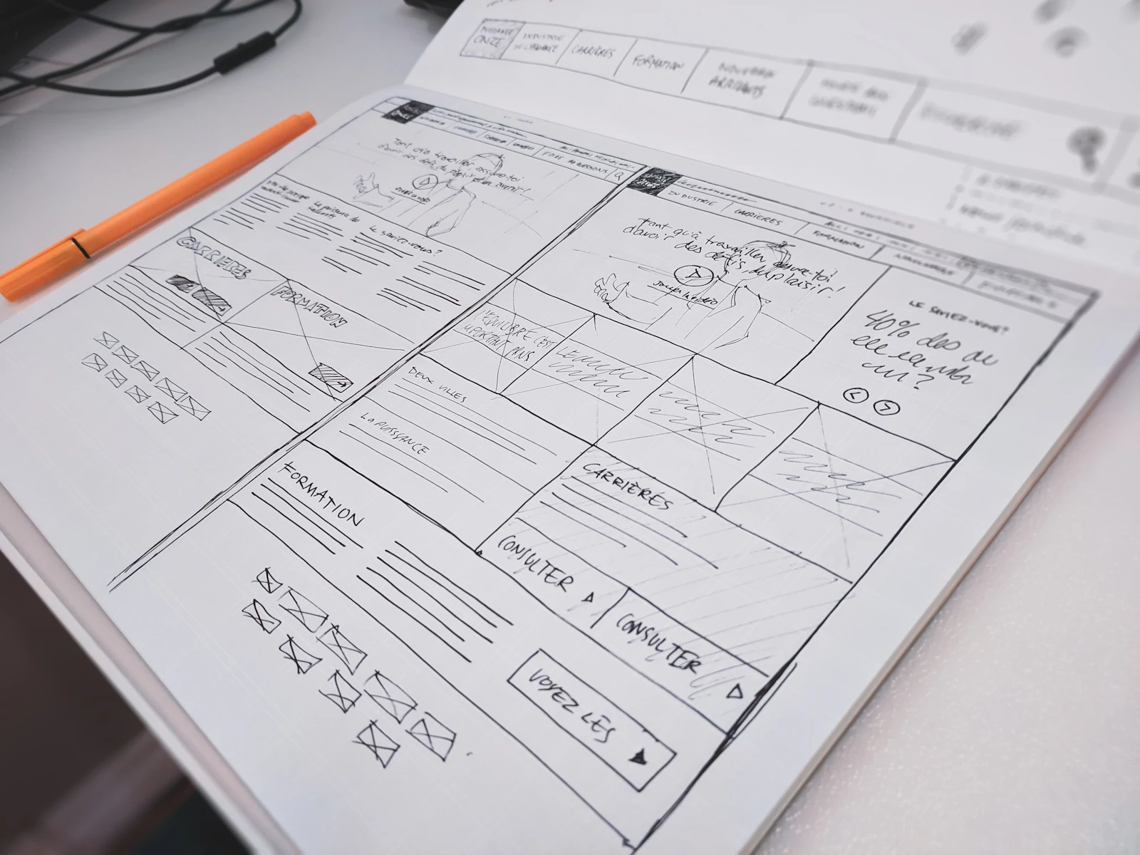
We kept the board but demoted it. The main view became the next sixty minutes: every observation, medicine round and review in time order, each with its bed.
Sleeping patients get a moon instead of an alarm. A nurse can move a routine observation by up to an hour with one tap, and the reason is logged for the morning team.
- a moon, not an alarm: obs can wait till 4
- one list, in time order. no hunting
- the clock that matters at 3 a.m.
It is the first screen on the ward that seems to know what time it is.
Prototyping where it would be used
From the third week the prototypes were real code, running on the ward’s own tablets with invented patients. Testing at night found what no daytime session could: glare, the need for a true dark theme, and targets big enough to press with gloves on.
What changed
After a twelve-week pilot on two wards, handovers were shorter, non-urgent alerts at night fell by more than a third, and nine in ten night nurses chose the new view when given the choice.
The figures matter less to me than one comment in the feedback box: “I stopped carrying the paper.”
What I’d do differently
I involved the day shift too late. Handover is a conversation between two teams, and the first version made sense to only one of them. Now I map both sides of every hand-off before drawing anything.
Sample case study: the client, team, figures and quote are fictional.